OVERVIEW
Nike has worked endlessly on enabling inclusion and access for all athletes* through various efforts from programming to adaptive product design. However, across Nike.com, there are loosely scattered pages across Nike.com about Nike's accessibility work and we do not have a centralized standup page that speaks to the commitment. I was the product designer, leading this initiative alongside the digital accessibility team. It was published on Nike.com/accessibility to speak on the adaptive product design, digital accessibility & compliance, stories of athletes* with disabilities, and Nike's value & story for our consumers.
KEY IMPACT
A centralized web platform about Nike's commitment to accessibility, shared with consumers - which did not exist prior.
Compliance officers and advocates are able to evaluate Nike's efforts and adherence to accessibility standards.
THE INTRODUCTION
Nike has worked on many efforts including but not limited to their production of Easy On (adaptive footwear), sponsorship of multiple adaptive athletes, established & continuously support the employee disability network, integrate digital accessibility efforts across their digital products & ecosystem.
While internal Nike employees are fully aware of the effort, many consumers are not.
That is a result of the lack of a standup web page about our commitments to accesibility and disability inclusion, which currently exists for sustainability efforts. And - across Nike.com, there are loosely scattered pages that touches upon various parts on how Nike integrates accessibility into our products and connect with our customers with disabilities.
GOAL 1
GOAL 2
GOAL 3

A standup on Nike's adaptive product design, digital accessibility & compliance, stories of athletes* with disabilities, and Nike's value & story for our consumers.
INTRODUCING

REQUIREMENTS GATHERING
My initial goal was to identify the standup page's goal and what would exist on this standup page. Working with our product manager, we've outlined that we want to showcase the following:
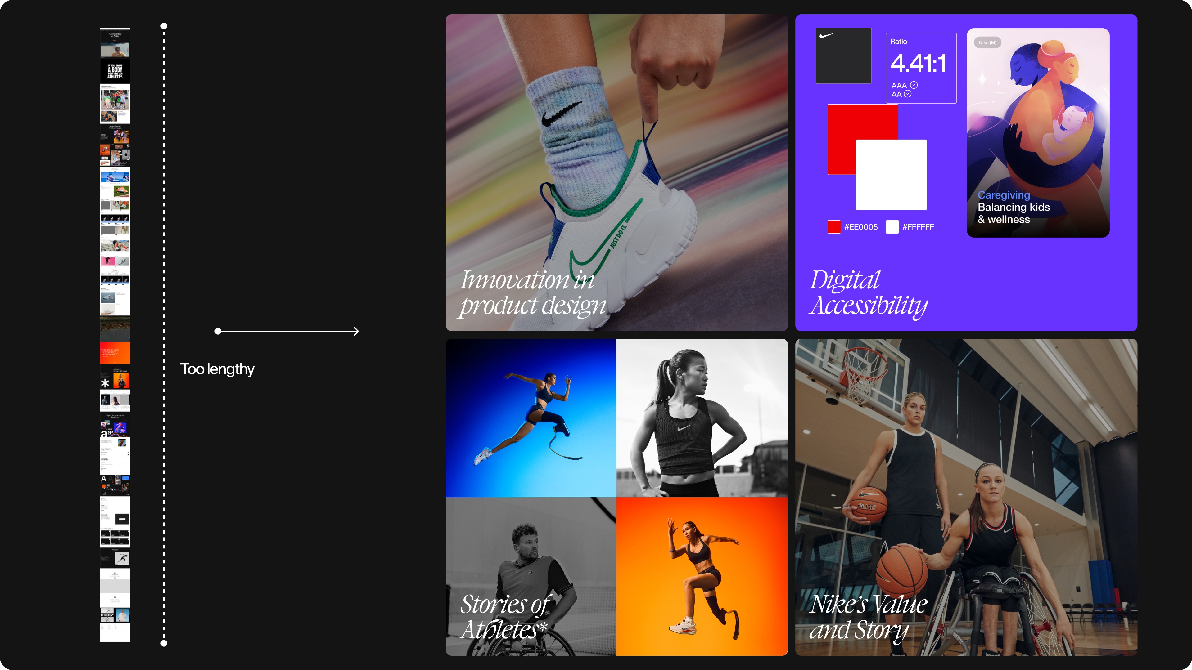
Innovation in product design: Features like FlyEase and other adaptive products.
Technical Accessibility: Ensuring Nike.com is compliant with WCAG standards.
Compliance and Regulation: Documentation of adherence to accessibility laws.
Company Values: Highlighting Nike’s support for inclusion and diversity.
How that will be visualized will be determined later on.
RESEARCH
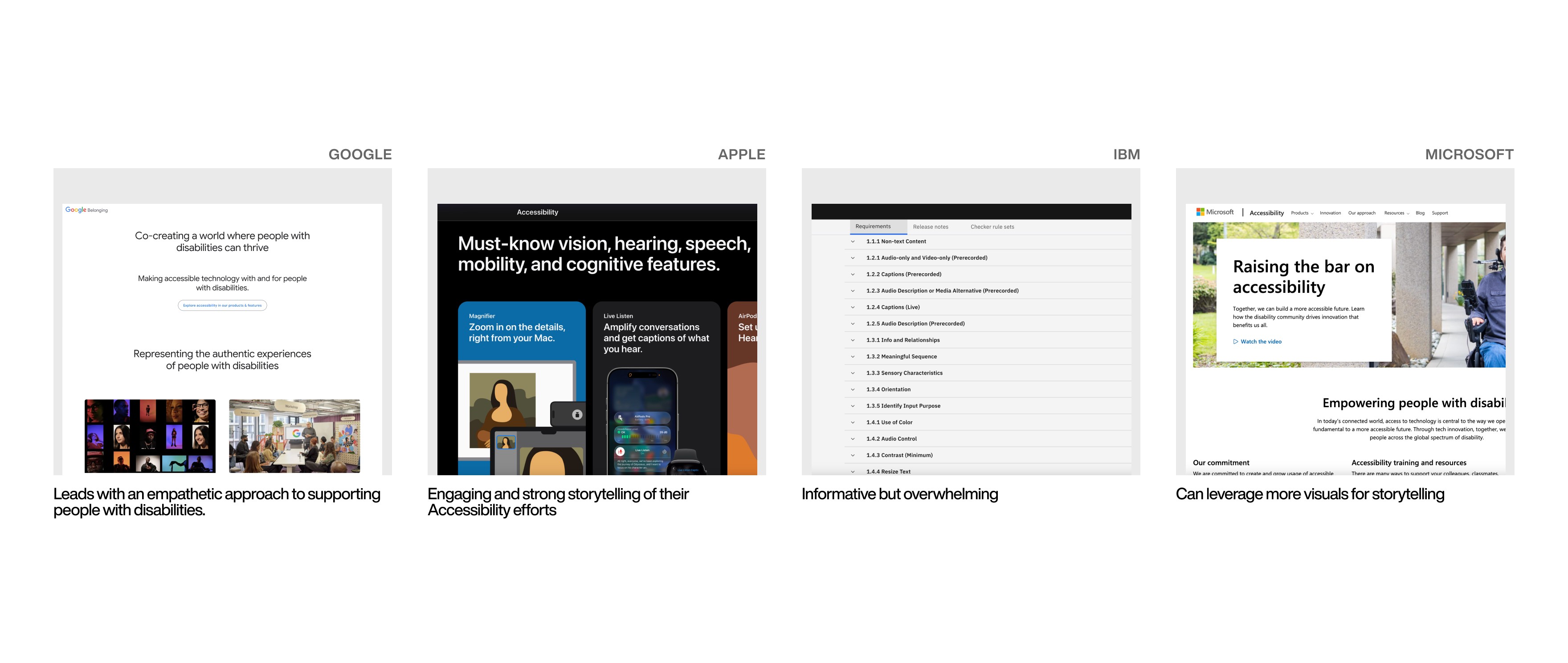
Given the timeframe that we had ~2 months to get designs rolling, majority of our research was based on determining the content we want to display which is shaped by the accessibility team's decision as well as shaped later by the legal team on what can or can not be shared publicly. I did research across various web platforms including Microsoft, Google, etc. to understand how they share about their accessibility efforts.
After reviewing other accessibility sites, we realized and concluded that while we will share similar information regarding accessibility as it relates to Nike, we will define the storytelling of the page differently which is core to Nike's success and identity. Other pages include a ton of information and content, but we want to ensure we align with Nike's robust and iconic storytelling approach. Therefore, we will approach the design differently and prioritize storytelling.

ART DIRECTION & VISUAL GUIDELINE

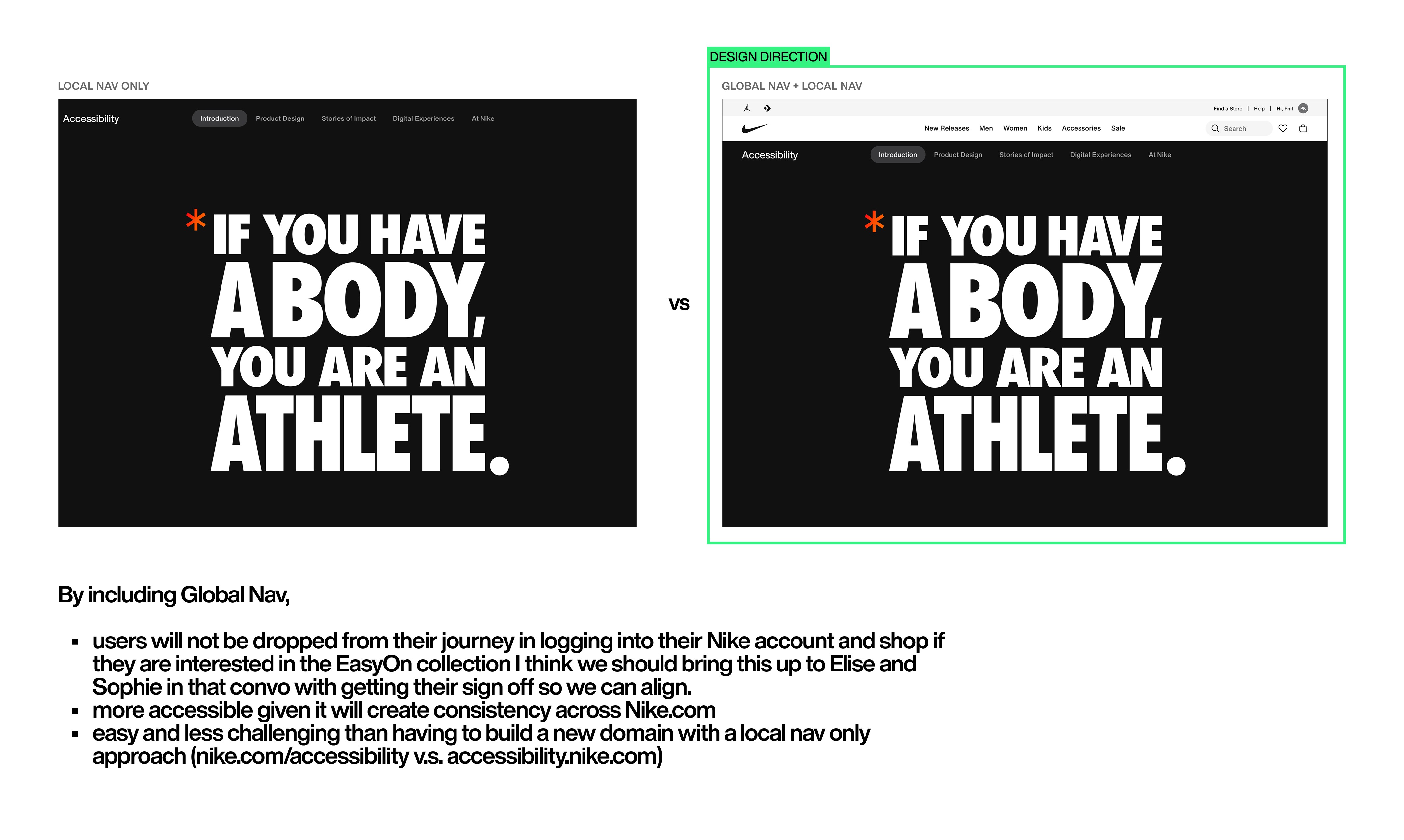
I worked on defining the art direction and creative strategy for the site. The core strategy centered around drawing identity from Nike's design system (Podium) while identifying areas to differentiate in order to establish this page as Accessibility at Nike than the other product-focused commerce sites on nike.com. We've worked with the Podium team to ensure components we are breaking are approved and are utilizing semantic tokens for best practices, especially as the system scales.
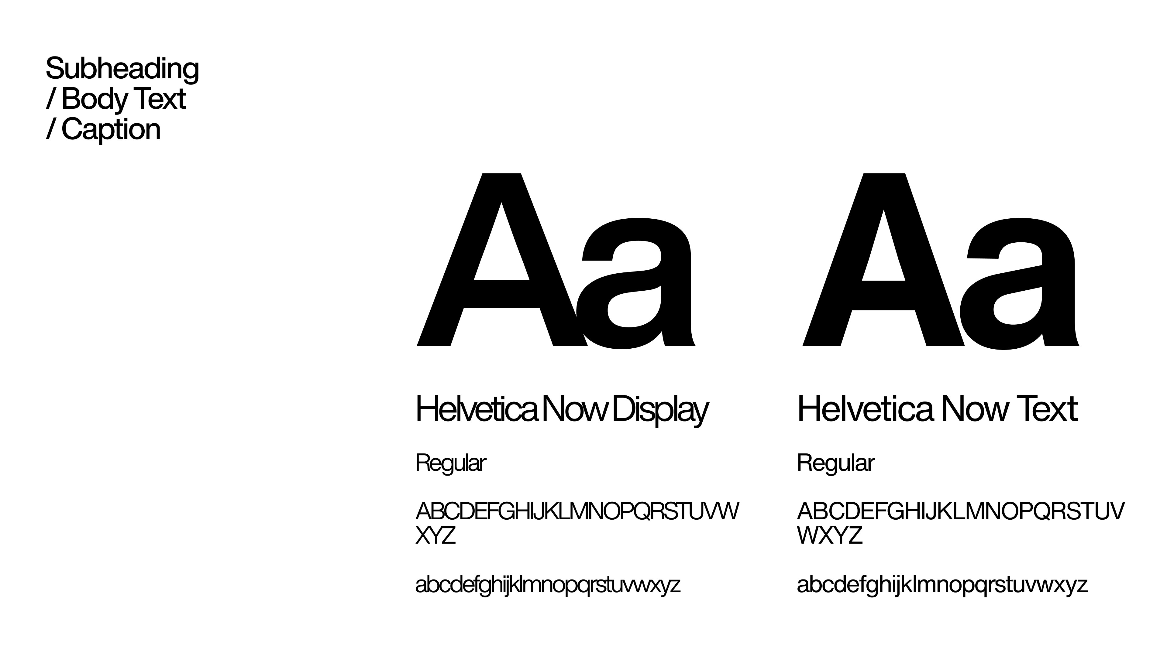
Typography
We chose Palatino as our typeface because it evokes authenticity, warmth, and an approachable voice to the site - —designing not just for performance, but for people.

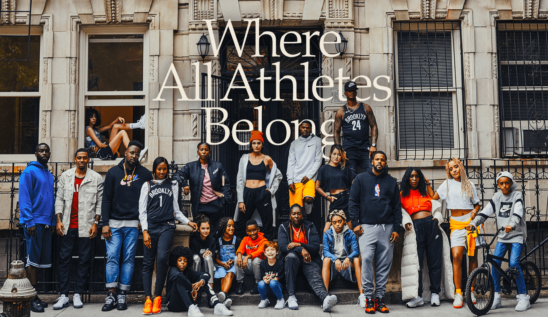
Imagery
We chose imagery the demonstrates - movement, joy, community, and victory - all of which are fundamental to Nike's values.

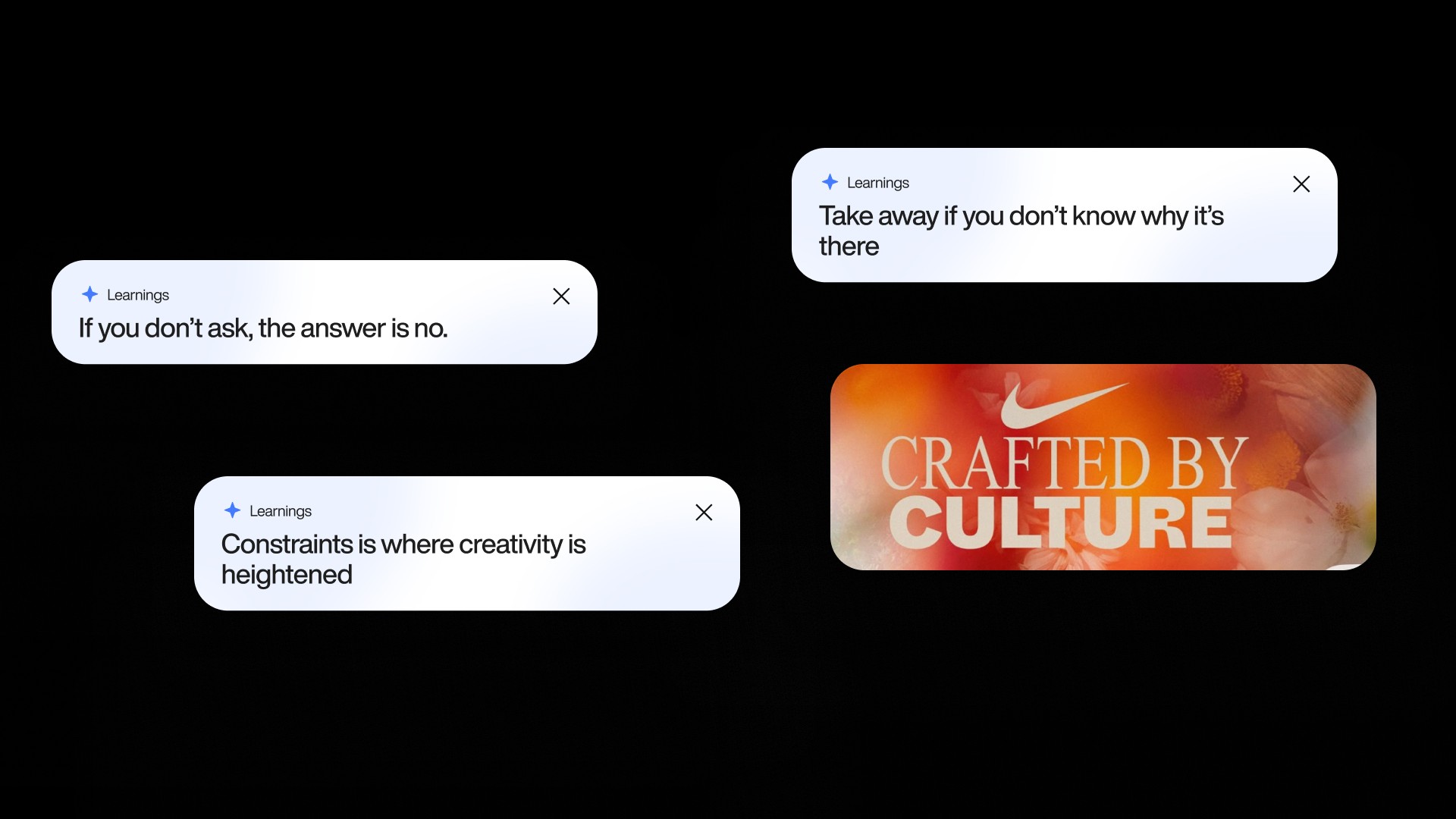
EXPLORATIONS AND PIVOTS
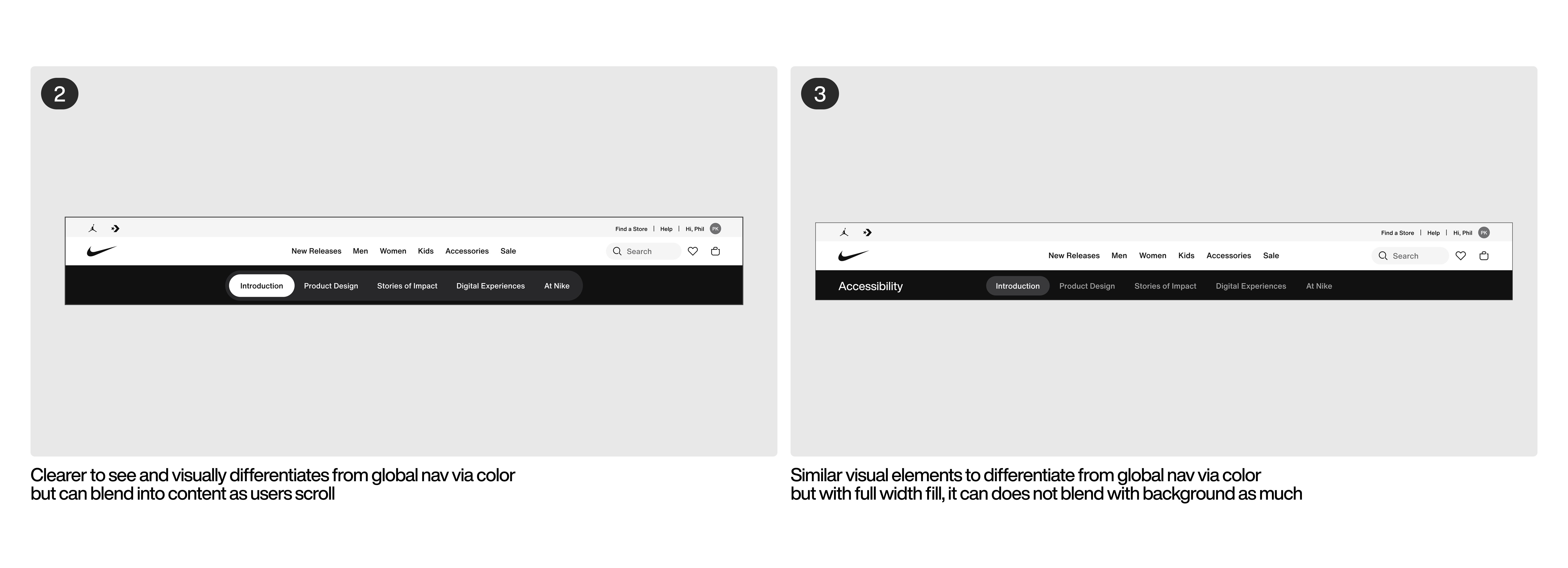
We've progressively made various iterations to the page via feedback across digital product design, legal, content design, and brand creative teams. The key pivots we've made in shaping the final shipt designs were as follow:
PIVOT 1


PIVOT 2
PIVOT 3


PIVOT 4


NEXT STEPS
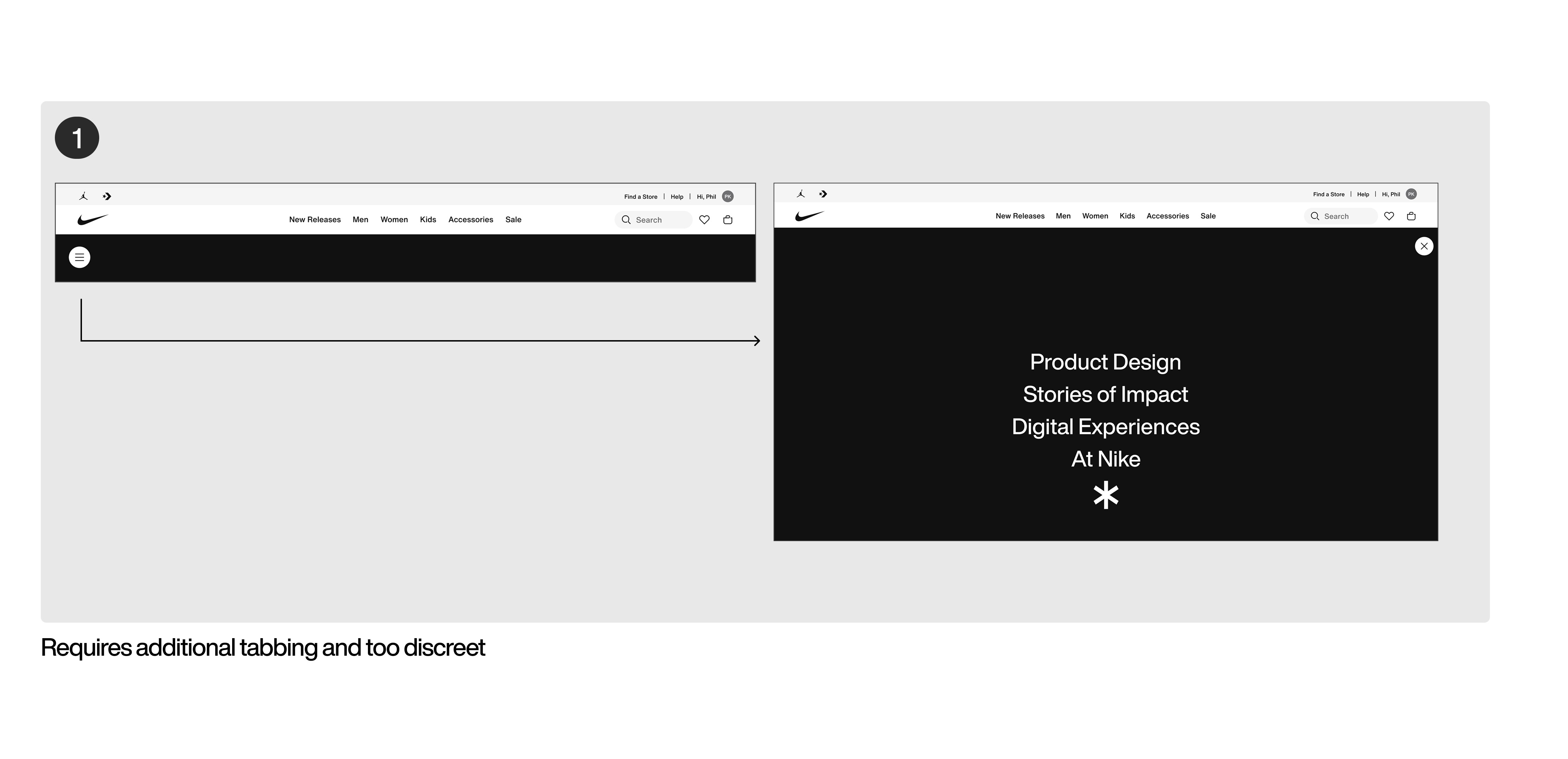
Post shipment, there are still areas to fix from my visual QA auditing done for engineering to fix. There are also transitioning and interactions to fix including ensuring that the when users click an item in the navigation it takes them to the respective section which we agreed with engineering to complete post MVP due to the timeline we had to publish the site.
In the near future, while majority of the items are evergreen, we want to evolve and update the page with new content that Nike has been working on within the disability space.
REFLECTIONS
Post shipment, there are still areas to fix from my visual QA auditing done for engineering to fix. There are also transitioning and interactions to fix including ensuring that the when users click an item in the navigation it takes them to the respective section which we agreed with engineering to complete post MVP due to the timeline we had to publish the site.
In the near future, while majority of the items are evergreen, we want to evolve and update the page with new content that Nike has been working on within the disability space.